


Visual Identity Rebranding
Coffee Business
I want to emphasize that this is not just a branding project, but also a personal business venture. While the focus is on developing a strong brand identity for our company, the ultimate goal is to establish a successful business that reflects my personal values and goals.
I believe that the success of this project will not only benefit the company but also my personal reputation and career aspirations. As I invest my time, energy, and resources into this endeavor, I am also building my own brand and establishing myself as a skilled professional in the industry.
Therefore, it is important to approach this project with a dual perspective, both as a branding project for the company and as a personal business venture for myself. By doing so, we can ensure that we are maximizing the potential for success and creating a strong foundation for the future.
Disclaimer

Project Goal

Since we a low-budget starting business, our goal is to create a brand that has an appealing identity and an authentic aspect for our beloved target audience. Aside from identity, we desire a coffee product that has an experimental flavor but eventually develops a good familiarity taste. As we value our roots respectively we wanted everything we made to be connected to our history.
Objectives
Produce a brand identity that is connected to
our tagline “You Matter, Take a Small break”.
Muni Muni branding must contain the following:
Brand questionnaire and research l Tagline l Brand Attributes l Mood Board l Stylescape l Logo l Brand Guide l Mockups
Phase 1
Design Frame Work
Phase 1 typically involves research and design exploration to ensure that the resulting brand is not only visually appealing but also authentic to the brand's history and values. It is crucial to establish a deep understanding of the target audience, market trends, and competitors to create a brand that resonates with consumers and stands out in a crowded marketplace.
During this phase, the designer/strategist and copywriter work together to develop a cohesive brand identity, including a brand name, logo, color palette, typography, and messaging. The ultimate goal is to create a brand that aligns with the company's motif and tells a compelling story that resonates with its target audience.
Fig 1
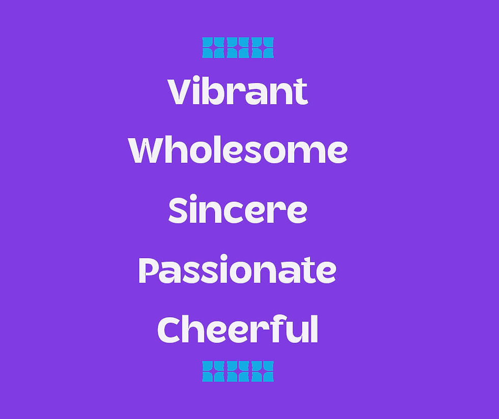
Fig 2
Through the process of conducting branding activities, we have been able to identify the unique attributes that define our brand. These attributes are vibrant, wholesome, sincere, passionate,
and cheerful.
We believe that our brand is more than just a logo or a slogan - it represents the very essence of who we are as a company. We strive to embody these attributes in everything we do, from our products and services to the way we interact with our customers and the
wider community.

Our vibrancy comes from our passion for innovation and creativity, always pushing the boundaries to create products that are fresh, exciting, and relevant.
We take a wholesome approach to everything we do, with a focus on sustainability, ethical business practices, and social responsibility.
Finally, we strive to bring a cheerful and positive attitude to everything we do. We believe that life is too short to be anything but happy, and we want our customers to feel that joy and positivity in every interaction
with our brand.
Sincerity is at the core of our brand, and we believe that honesty and transparency are essential to building trust and long-term relationships with our customers.
Our passion for what we do shines through in every aspect of our brand, from the products we create to the customer service we provide.
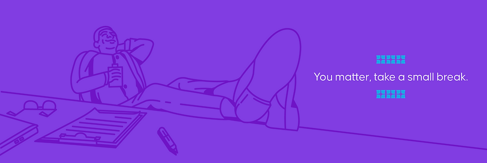

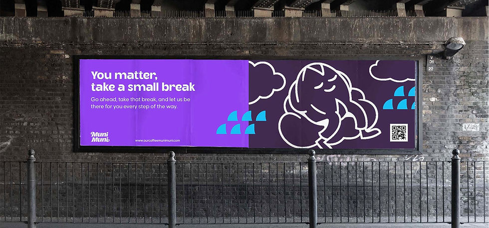
At our coffee bottle brand, we're passionate about promoting self-care and taking a moment to recharge. Our brand tagline, "You matter, take a small break," isn't just a catchy phrase - it's a belief that we discovered through our own experiences. We know how easy it is to get caught up in the hustle and bustle of everyday life, but we also know that taking a small break is essential to maintaining a healthy lifestyle.
That's why we've made it our mission to encourage this practice and what better way to do it than with our flavorful coffee bottle? Our brand story is all about celebrating the little moments and making time for yourself, and our tagline embodies that sentiment perfectly. So go ahead, take a sip of our coffee, take a deep breath, and remember that you matter - and taking a small break is an important part of your journey towards a happy and healthy life.
Stylescape
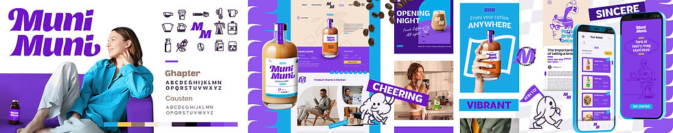


By plotting all the brand attributes and connecting them to our tagline we were able to create this stylescape that contains our whole visual brand identity.
Logo Construction
The tagalog word Muni Muni stood out to us during the process of choosing our name since it is remarkably memorable for our target audience due to repetitiveness and corresponds to how we wanted to be represented
as a brand.
Muni Muni is an easy-to-remember word, therefore we decided to use the wordmark as the brand's logo to increase our recognition. This bold and wavy letter form we design is mimicking the wave of the cloud and its boldness is creating a strong desire for attention. In addition, we added a hidden coffee bean symbol between the letters ‘u’ and ‘n’ to connect our industry, making every decision we made here remarkably related to our goal.
Logo Responsiveness
A creative approach to remain responsive across small mediums.
Root Pattern
Because we wanted to be true to our wordmark and give our pattern a unique identity, we artistically explored patterns inside the logo.
Here are 3 final symbols we aim to use for our brand patterns
seen below.
Because we wanted to be true to our wordmark and give our pattern a unique identity, we artistically explored patterns inside the logo.
Here are 3 final symbols we aim to use for our brand patterns
seen below.
Credited Pattern
1.1 Pattern is utilized as an accent for a design and is typically employed for paragraphs with sincerity in the tone, usually in the highlight color.
1.2 Pattern can used in any type of design but implemented minimalistically and creatively.
1.3 Pattern this stand as divider for design but also act as accent shape.
2.0 Pattern and 2.1 Pattern flags are used a lot for design that contain empowerment, passion, and rewards.
3.0 Pattern and 3.1 Pattern another type accent shape used for design
and ideally this shape mean flow
Muni Muni Halftone
1.2 Pattern are only credited pattern used for half tone, an added layer for our photo.


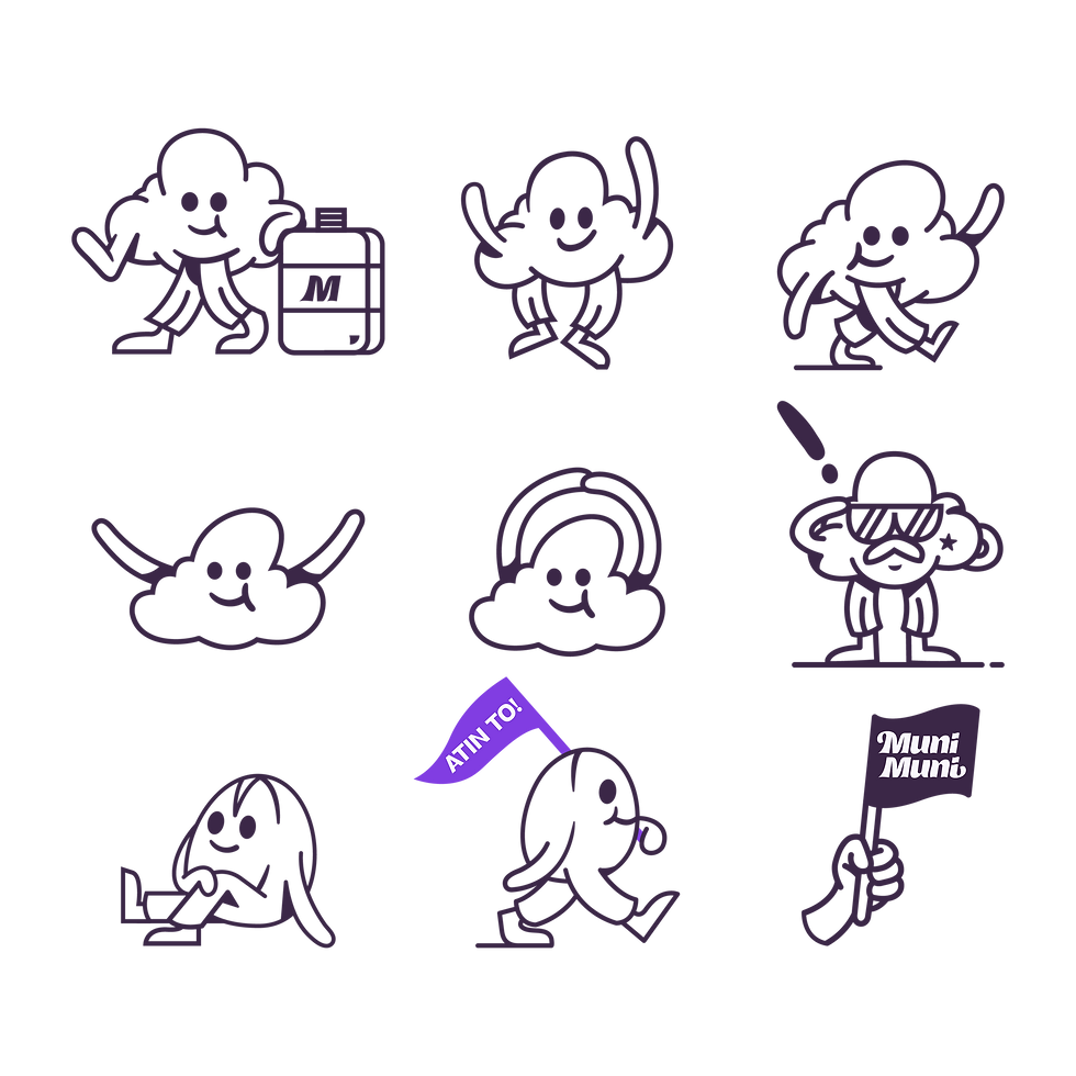
We are working to give our brand an approachable identity and a sense of companionship for our target audience. So we've introduced these endearing characters for our brand, Ulap and Kape Butil.
We relate our character to our target audience by creating this character to life, most of them are working professionals therefore we put pants on these characters to feature them.
Simple shapes, curvy corners, and elastic form are key design elements that give these creatures their cheery and charming appearance.
The Creation

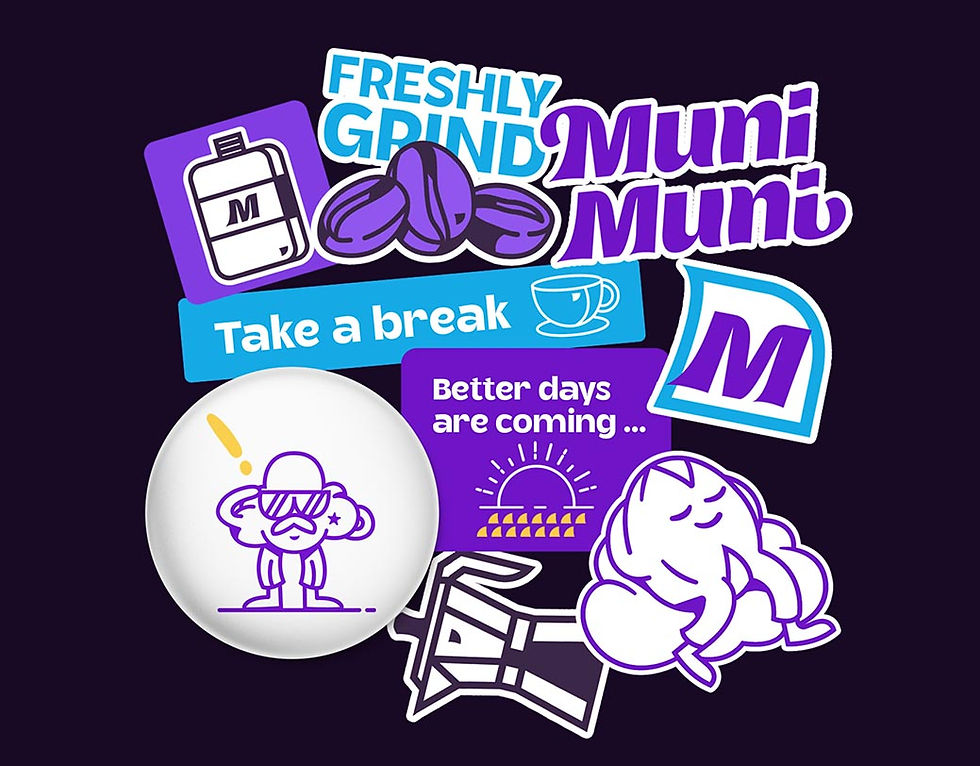
Ulap and Kape Butil has variety of apperance they’ll be in stickers, on product labels, t-shirts, social posts, website, ad poster and even stuff toys we consider in the future.

Illustration
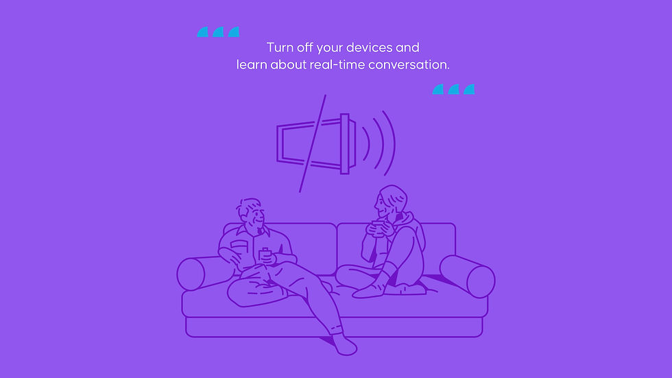
We create this to visually communicate the importance of taking a break and the various activities one can enjoy while sipping on their coffee. The simplicity of the illustrations ensures that the message is communicated clearly to the target audience, creating a strong visual impact. By using this style of illustration, the brand can establish a unique visual identity that differentiates it from competitors and appeals to its target audience. Additionally, the use of single line weight illustrations can make the brand's message more memorable, further increasing brand recognition and customer engagement.

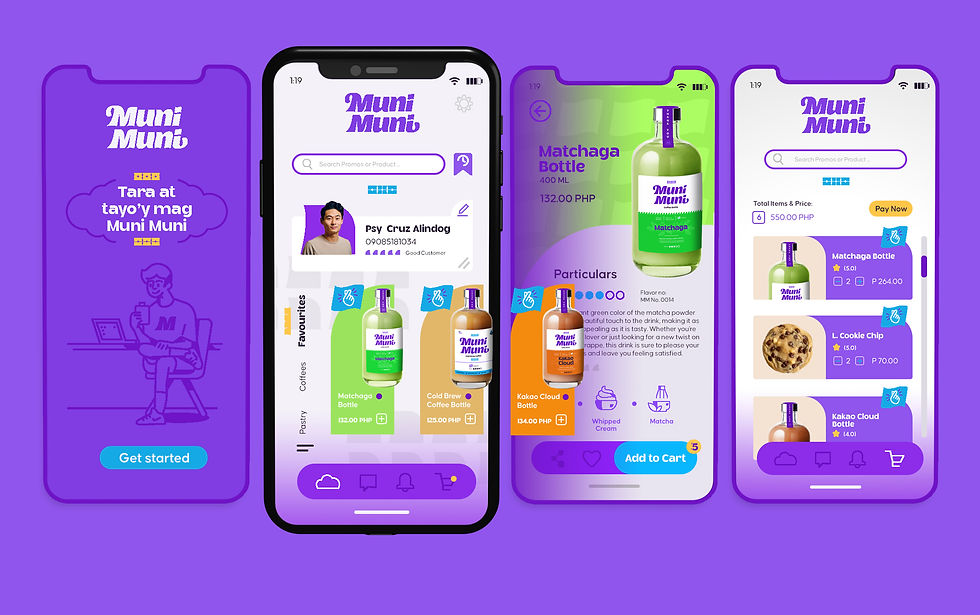
Mockups and Prototypes


Mobile Delivery


About Us

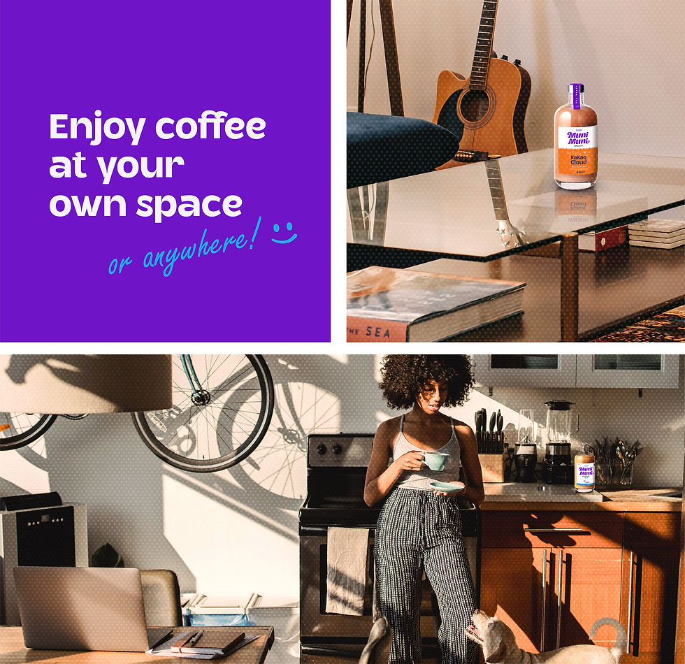
Coffee has played a big role in our relationship from the very beginning. We've always been supporters of small coffee shop businesses in our neighborhood, and we never imagined that something as simple as a cup of coffee could bring us closer together as partners. We've found that coffee is not just a way to wake up and get energized, but it's also our safe space to take a break from work, escape the hustle and bustle of the city, relieve stress, and talk about anything and everything. It's a way for us to enhance our creativity through drawing, painting, writing, and simply thinking freely.
Our love for coffee has inspired us to share our stories with others, and we believe that we're not the only ones who enjoy a good cup of coffee. That's why we want to start our own coffee in a bottle so that everyone - a coffee lover or not - can have a companion during their break times. It can be convenient to carry coffee bottles anywhere without spilling drops. As long as you drink what you can, the rest of your coffee can be kept safe. We want to remind you to take your time and have a meaningful pause in your day, and we're here to accompany you anywhere at any time. We've carefully thought about the branding, quality, and taste of our coffee, and we're excited to start producing advantageous and long-lasting bottles that are perfect for travelers, groups, students, and workers. We hope you enjoy it as much as we do!
We're 100% committed to supporting local products and farmers by using their single-origin beans. We're even planning on taking you on a tour with us, where we'll taste different kinds of beans that were originally roasted in various places around the Philippines. And not only do we want to support our farmers and economy, but we also want to help the environment by promoting recyclable materials in our coffee production.